
Introduction
Fotomatón is a 360° photography service specialized in capturing unique moments during events such as weddings, birthdays and special celebrations.
The Challenge
The Fotomatón project seeks to improve the user experience of the website, optimizing both the visual design and usability. The main focus is to modernize the interface to make it more intuitive, with a clear navigation flow that makes it easier for users to find information and make reservations.
Common challenges include:
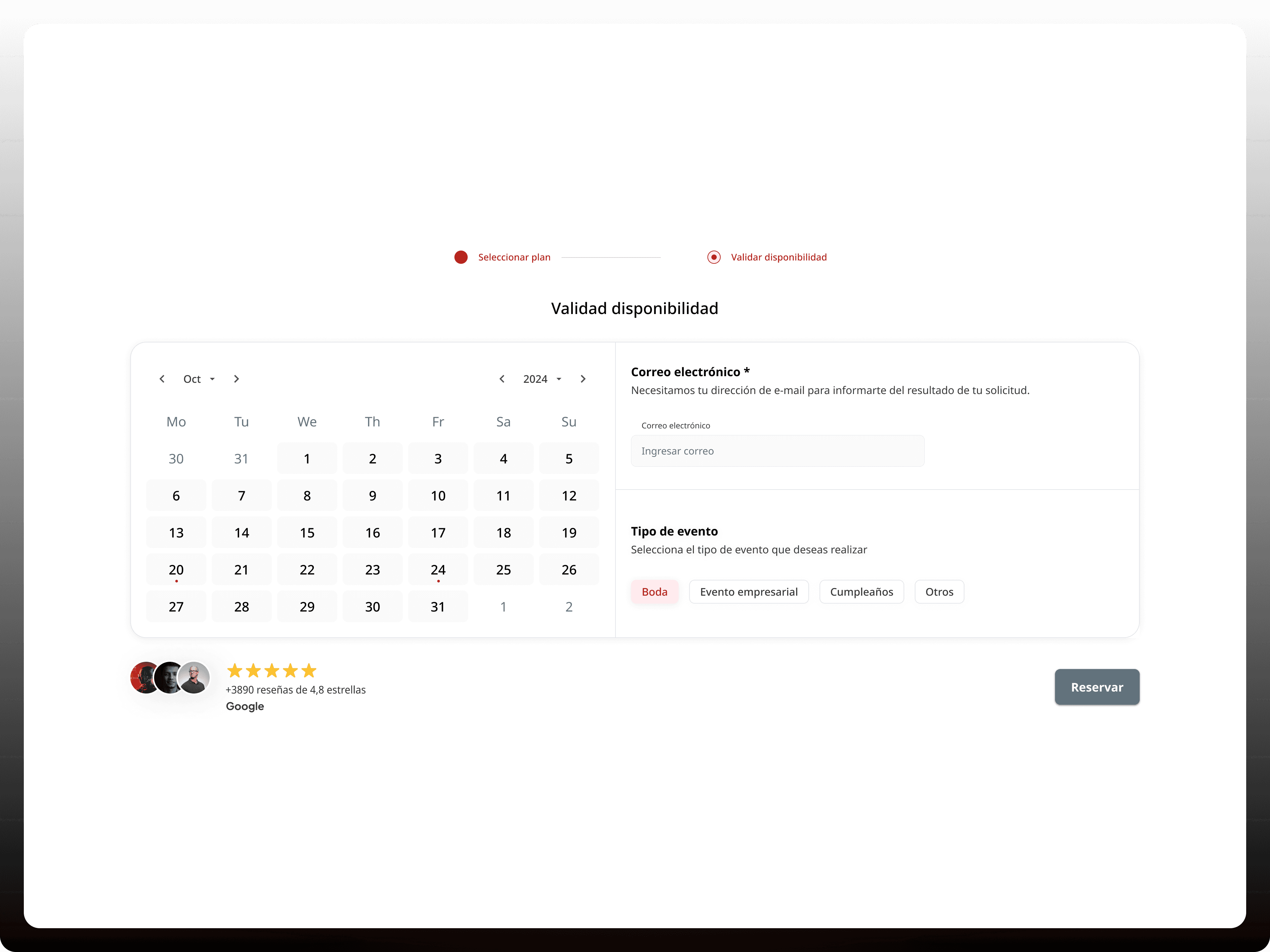
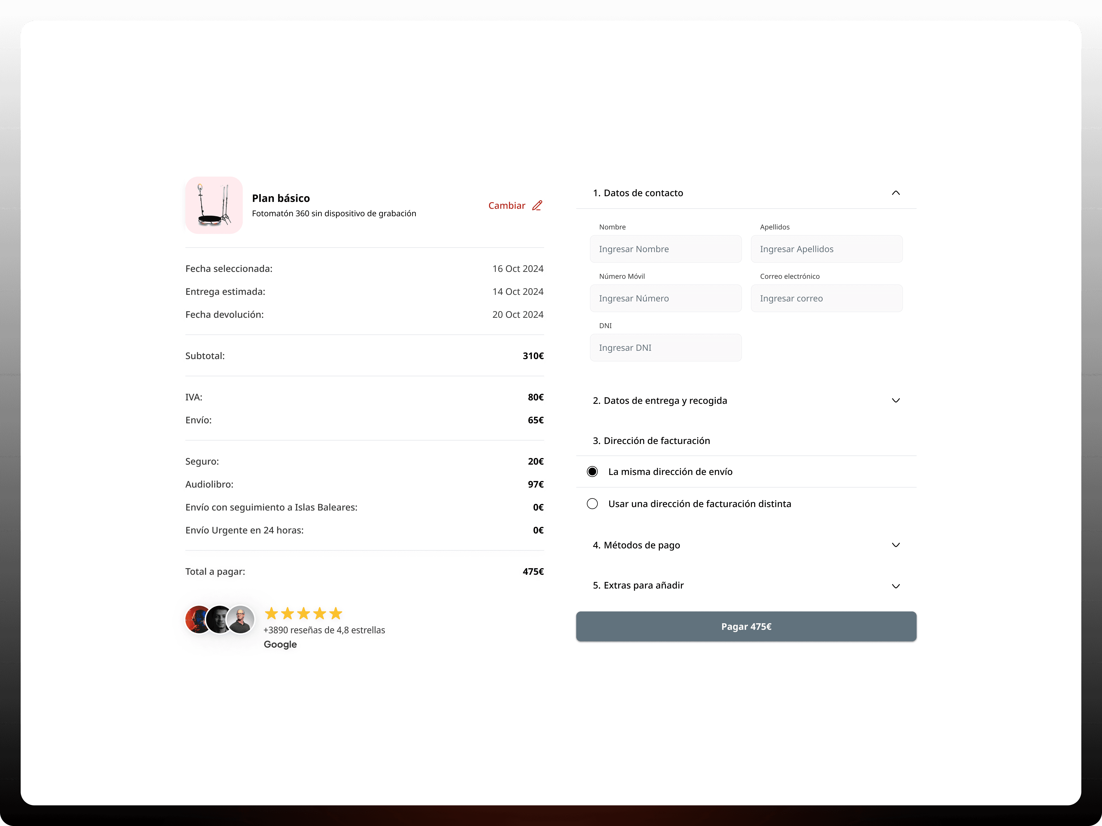
Improving the booking experience: The goal is to simplify the booking process for users, reducing steps and making real-time availability of the service more evident.
Optimizing navigation: Facilitating access to key information, allowing users to quickly understand the features and benefits of the service without distractions or unnecessary steps.
Increasing the conversion rate: Incorporate visually appealing sections that highlight benefits and patient testimonials to generate greater trust in the service.
Responsive and accessibility: Ensuring that the site works optimally on all devices, prioritizing accessibility and usability on mobiles and tablets.
The Solution
Fotomaton offers a solution that improves the user experience, making it easier to book the service and allowing easier access to key information.
Fotomaton's key features include:
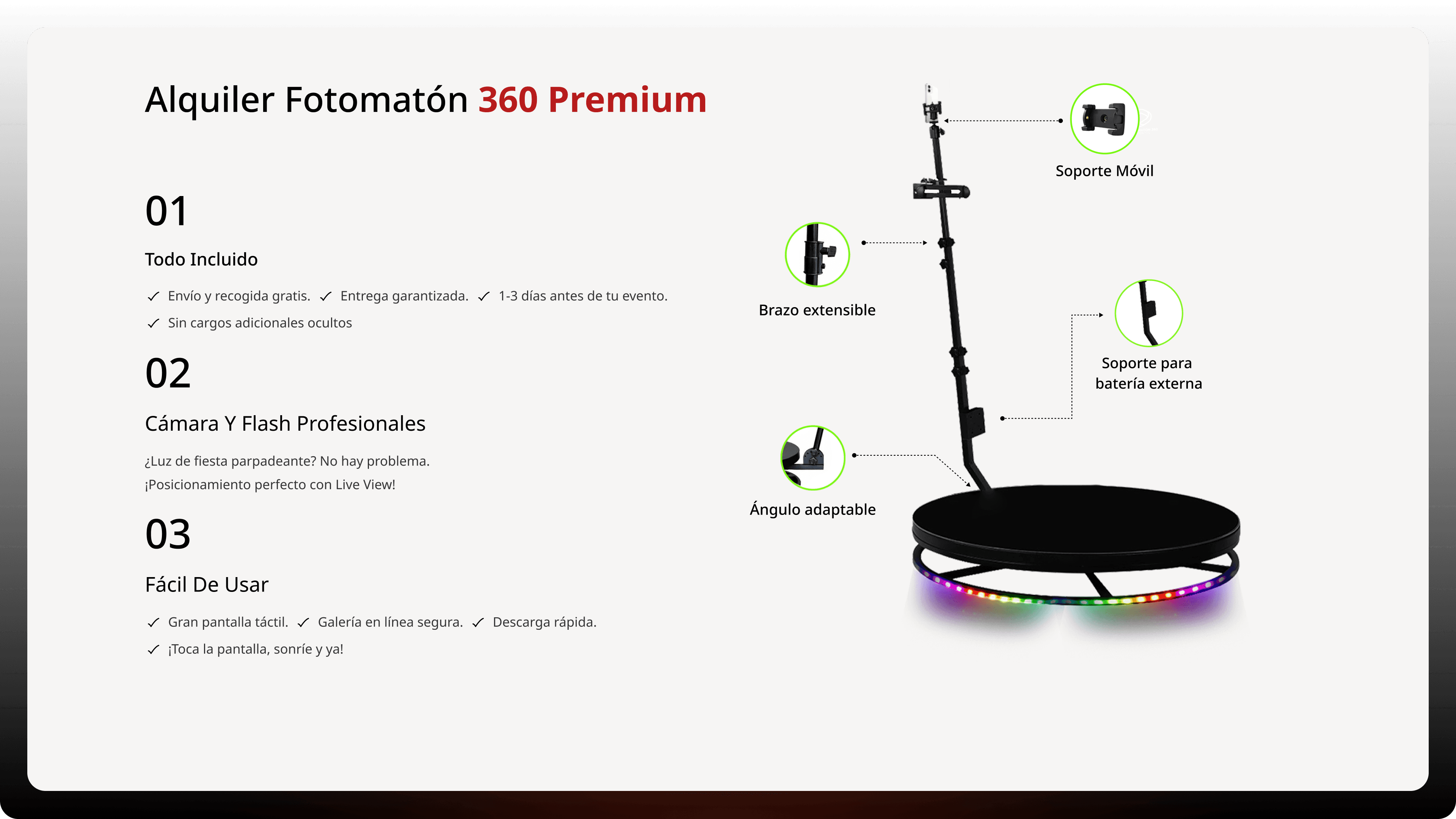
Improved information architecture and simplified navigation: Content structure was reorganized so that users can find information clearly and quickly. The visibility of the most important elements, such as rental plans and booking options, was prioritized. This included simplified navigation, with more intuitive and accessible menus, improving the experience on both desktop and mobile devices.
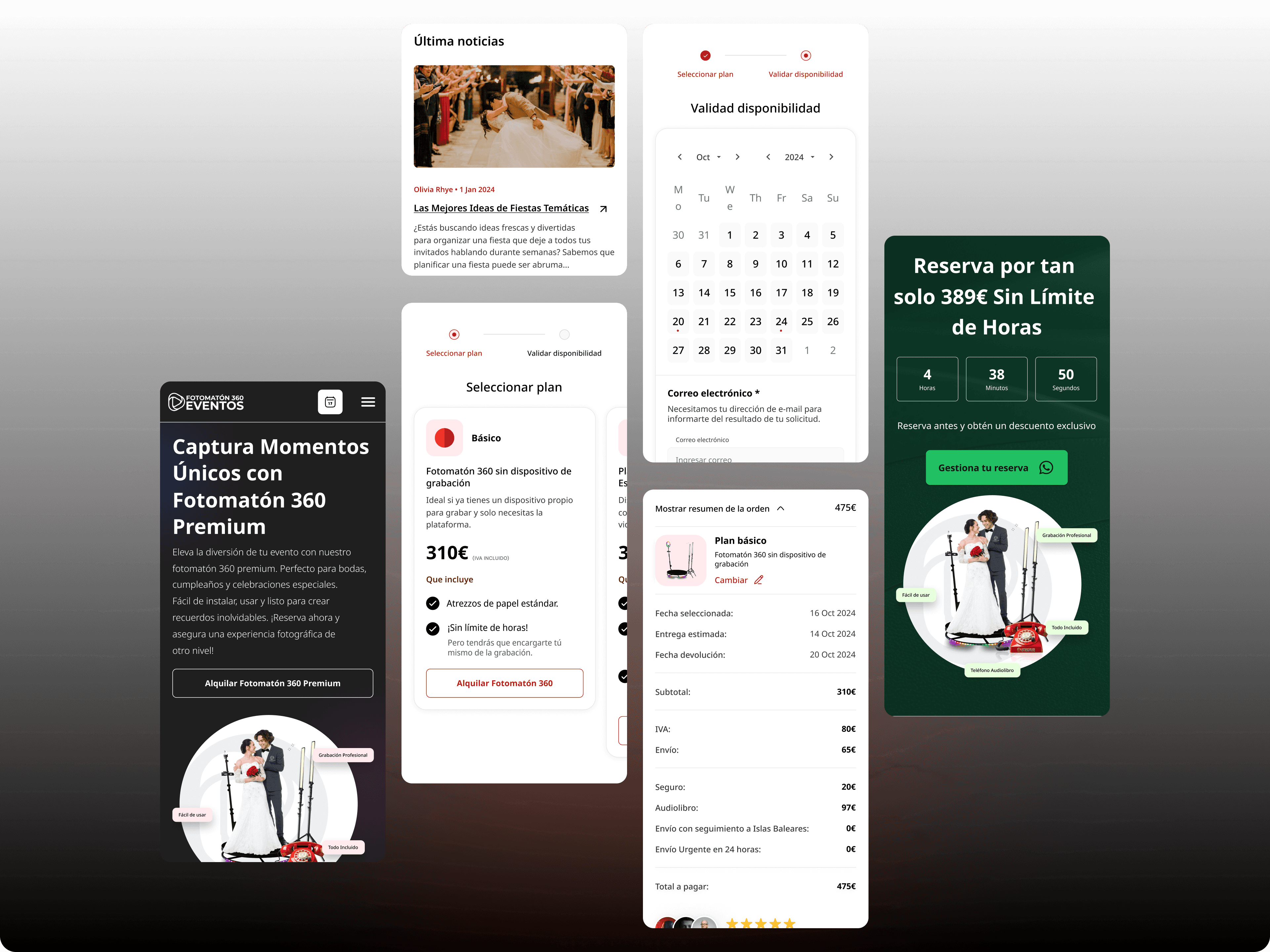
Responsive design and optimization for mobile devices: A fully responsive design was implemented, ensuring an optimal user experience on any device, from mobile to desktop screens. All elements of the site, such as text, images and buttons, fluidly adjust to different resolutions, ensuring that navigation and interactions are consistent, intuitive and accessible, regardless of screen size.
Visually attractive and consistent interface: The visual design was optimized with a modern, clean and consistent aesthetic that reflects professionalism and advanced technology. Recognizable visual design patterns were implemented to facilitate the recognition of actions, using a contrasting color palette and legible typography. These changes allow users to easily identify interactive elements and navigate the site without confusion.
Optimizing the user experience with microinteractions: Microinteractions have been added to action buttons, forms and interactive sections, providing immediate feedback to the user. These small animations improve the understanding of the system, ensuring that users receive visual responses when interacting with key elements, such as selecting booking dates or filling out forms. This increases fluidity and makes the experience more dynamic and engaging.
The Results
By improving Fotomaton, customers can now optimize their purchasing processes:
Simplified booking flow: The booking process was optimized, reducing steps and highlighting real-time availability, improving the user experience.
Clear and direct navigation: The new structure allows quick access to key information, highlighting benefits and features of the service without distractions.
Attractive and persuasive design: Visual elements were added that reinforce confidence in the service, such as testimonials and featured sections, increasing the conversion rate.
Responsive and accessible optimization: The interface was adapted for mobile phones and tablets, guaranteeing a fluid and accessible experience on all devices.
Conclusion
Regarding UX, the focus was on creating a fluid experience that reduces barriers for the user. The information architecture was reorganized to facilitate the search and selection of services, implementing a logical and predictable flow. Interactions were optimized through microinteractions that provide immediate feedback, helping users understand their actions within the system. All of this has contributed to creating a more reliable and enjoyable experience for users.
From a UI perspective, work was done on the visual coherence of the design, with an attractive color palette and a typographic design that ensures readability on all devices. Responsive design has been central to this project, ensuring that users enjoy a consistent and frictionless experience, whether on mobile, tablet or desktop. The improvement in visual hierarchy has also made it easier for users to easily identify key actions, such as booking the service or comparing different plans.
In short, the project has laid the groundwork for a comprehensive improvement in Fotomatón's usability and aesthetics, ensuring that users enjoy a more efficient and enjoyable user experience.

